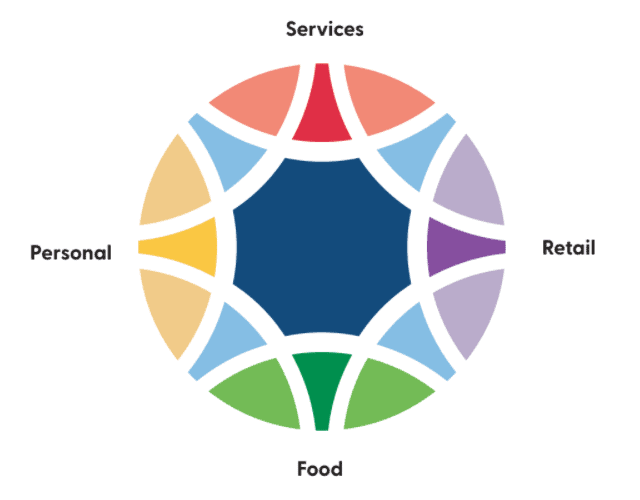
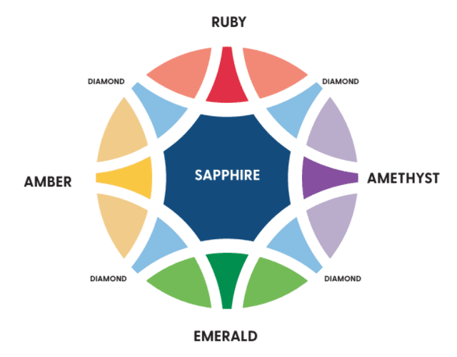
Those who know Clarkson Village well, know it’s an absolute treasure — and our brand identity helps tell our story far and wide. The Clarkson Village BIA logo features brilliantly coloured gems coming together, symbolizing how our treasured community comes together to shine.
Each gem represents part of what our business community has to offer, and the associated colours are used to promote each category.


- Rubies represent wealth and prosperity, and are associated with our professional services such as law, insurance, medical, banking and real estate.
- Emeralds are paired with food offerings — they are known to enhance energy levels.
- Amethysts represent retail. These gems are believed to help relieve stress and strain.
- Amber is paired with personal services including salons. Amber is regarded as a stone of courage.
The centre of our logo is a sapphire. Sapphires are believed to attract abundance, blessings and gifts. It’s the perfect gem to represent an area that first became known as Clarkson Village in 1808 and remains a strong community more than 200 years later. The sapphire represents the BIA as a whole, bringing businesses and people together.
Together, we are Clarkson Village. A treasured Ontario community.
Our village is a place where every place feels like “your place”. Where customers are treated like family. Here, new businesses fit right in alongside those that have been here for 40+ years. Our business area is valued for its sense of community, history, beautiful surroundings, and excellent, diverse businesses. Clarkson Village is beautifully multifaceted and full of heart.
To learn more, watch the video below about how our brand identity was developed, and more on the story behind the logo.